Digital transformation of Kandla Port
I joined a government-scale digital transformation project at Deendayal Port Authority’s Kandla Port in Gujarat, a 24/7 operation handling over 127 million tonnes of cargo annually with legacy, paper-based access management spanning 40+ years. This was mission-critical infrastructure, not a convenience app: the e-Drishti system had to safely integrate RFID, Automatic Number Plate Recognition (ANPR), smart cards, biometric systems, and APIs with Customs, the Ministry of Shipping, and highway authorities, where any design error could trigger operational chaos.
Year
2022
Scope
Mobile & Web Portals w/ Payment integration & Permit Registration
Timeline
3 months

Key Design Decision
Role-based interface architecture – Design fundamentally different screens for port authority (compliance-focused), drivers (anxiety-focused), and security staff (monitoring-focused) Offline-first + connectivity awareness – Since permit requests, vehicle registration, and status checks happen in areas with spotty connectivity, I designed local caching + sync patterns that made poor connectivity feel intentional Literacy-inclusive design – Beyond simple icons, I used color-coding, progressive disclosure, SMS notifications, and contextual help to ensure even drivers without formal tech experience could register vehicles and request permits independently Real-time tracking visualization – For security teams, I designed a dashboard showing live vehicle positions using heatmaps rather than complex coordinate systems Payment flow redesign – Integrated cashless payment (critical government requirement) without adding cognitive load to the transaction flow
Designing for constraints as feature
Theme | Problem / Constraint | Design Response | Key Design Decision |
|---|---|---|---|
Low literacy | Many drivers could not rely on text-heavy labels to navigate the system. | Used visual-first navigation: icon system for permit status (green = approved, orange = pending, red = rejected), color-coded workflows, progressive disclosure (3 critical steps instead of 15 fields), and contextual help with icons plus brief local language phrases. | Placed the most critical field (vehicle number) first in a large visual field in vehicle registration, rather than burying it inside a long form, so the experience felt less overwhelming. |
Poor connectivity | Permit requests, registrations, and status checks often happened with spotty or no internet, causing failures and dead-ends. | Designed offline-first interactions: cached permit requests, registrations, and status checks locally, built “offline awareness” to change behaviour when offline, and created sync patterns that avoided “connection lost” dead-ends. | When a driver requested a permit without internet, the app accepted it locally, showed a “Synced when connected” status, and kept the driver informed so the request never felt lost. |
Role-based experience | Different users (drivers, port authorities, security staff) had conflicting needs and mental models. | Built fundamentally different interfaces for each role: drivers saw minimal, reassurance-focused flows; port authorities saw compliance, audits, and approvals; security staff saw monitoring tools like alerts and heatmaps. | Ensured drivers never saw compliance data and port authorities never saw driver anxiety UI, so each experience was tailored rather than one-size-fits-all. |
Cashless payments | Government-mandated cashless payments risked adding friction and confusion to permits. | Integrated cashless payments without adding complexity: payments occurred after permit confirmation, with single-tap approval and SMS confirmations for every transaction. | Separated “get approval” from “pay” so drivers did not confuse payment failure with permit denial. |

Measured Outcomes:


Speed:
Metric | Before | After | How It Was Achieved |
|---|---|---|---|
Permit approval time | 30–60 minutes | Under 10 minutes | Clear feedback loops and reduced uncertainty, rather than only improving interface speed. |
Scale & Adoption:
Metric | Outcome | Detail |
|---|---|---|
Adoption | 10,000+ downloads | Achieved on Google Play Store within 3 months. |
User satisfaction | 4.4-star rating | High rating, especially important for a government app. |
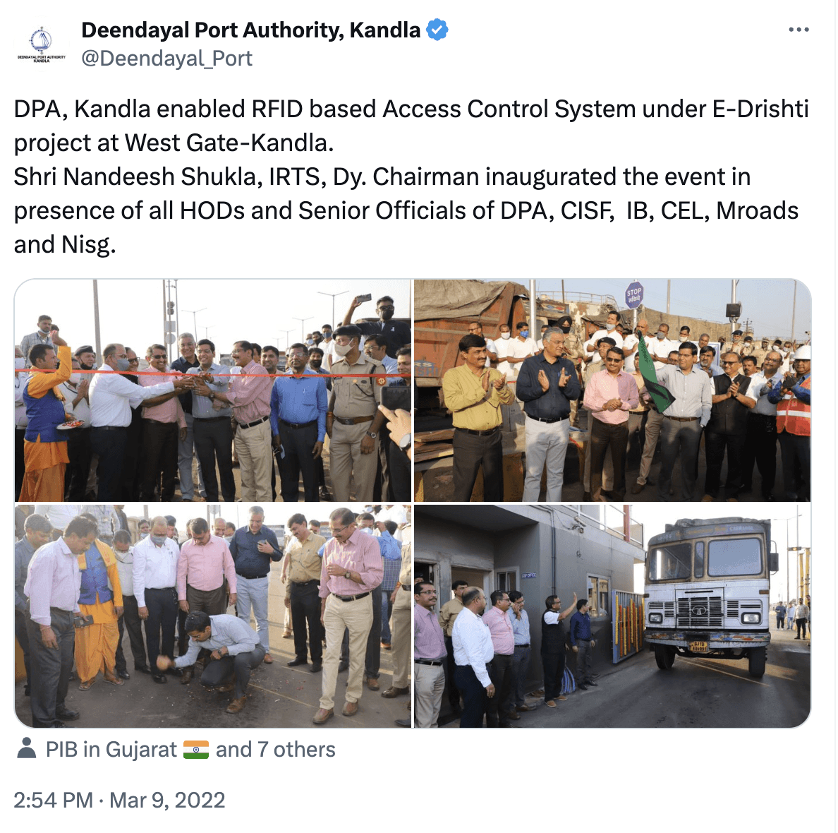
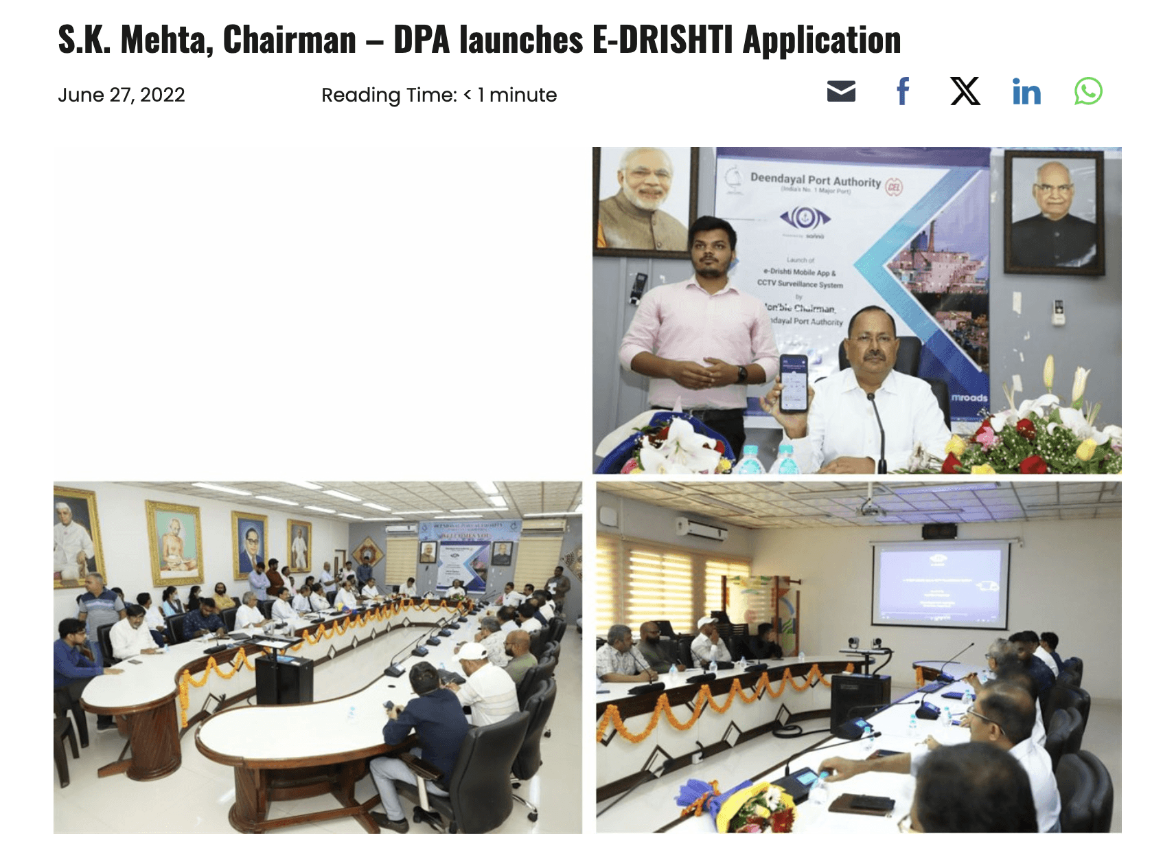
Deployment | Multi-gate rollout | Successfully deployed across multiple gates: Phase I West Gate commissioned March 2022, mobile app launched June 2022. |
Qualitative Feedback:
User review: "The access control app seamlessly combines user-friendly design with robust security features. Its intuitive interface simplifies the often complex task of managing access permissions."
Driver feedback: "User friendly, easy to use. Very easy to raise permits and enter the port."
Operational Impact:
Impact Area | Outcome |
|---|---|
Gate operations | Significantly reduced entry gate congestion. |
Permit process | Eliminated 30-day permit cycles. |
Payments | Enabled 24/7 cashless transactions. |
Reliability | Maintained 100% system uptime during high-traffic periods. |